Checkbook Ordering: Creating Clarity from Supplier Limitations
When your delivery provider offers almost no data and no map, even a simple flow becomes a user-experience puzzle.
This case shows how I redesigned the entire journey despite severe supplier limitations.
My Role:
Research, UXUI Design, Prototype
Platform:
iOS App


Background
The bank sought to expand its checkbook ordering process by introducing a new delivery method that allows customers to collect their checkbooks from a nearby store.
Previously, users were limited to postal delivery sent exclusively to the account’s registered address. This created delivery failures, return shipments, and unnecessary operational costs.
The new capability aimed to offer customers a more flexible, convenient experience and provide the bank with a more reliable and cost-effective operational flow.
The project began on iOS with the understanding that a scalable solution would later be implemented across other products as well.
Challenges
Each delivery method behaves differently
Every delivery method has its own constraints, such as how many checkbooks can be ordered and the degree of control over the delivery location.
Our delivery provider provides limited data and no map tool
They provided store locations, but the data was extremely limited: users could search only by city, not by address or by their own location. In addition, no map tool was included.
Research & Competitive Insights
Some banks embed the supplier’s map via WebView
Only few banks offer pickup-point ordering. Among those who do, some banks use a WebView integration to present their supplier’s own map interface directly inside the flow
Inspiration from ecommerce
To broaden the perspective, I reviewed local Ecommerces, which often offer a map or display store proximity in kilometers. This reinforced the need to adapt to the market and create our own map
Risk around store comments
Some suppliers allow branches to add free-text comments. After checking with the supplier, I confirmed that no comments would be delivered


Current Situation
Before the redesign, the flow was linear and limited. Users began by selecting the number of checkbooks, continued to verify their mailing address, and ended by confirming a PDF containing the delivery terms. There was no option to choose or browse pickup points.
Reduces address-related delivery failures
Improve first-attempt delivery success, and decrease the operational workload caused by delivery returns.
Simplifies decision-making for users
By clarifying the differences between delivery methods and helping them choose the most suitable one.
Creates a scalable map component
That the app could later use for additional features (ATMs, card pickup, etc.)
Ideation
My goal was to design a flow that:
Concept 1.
Keep the traditional 2-step flow
(quantity → delivery method)
I began by examining whether to keep the traditional flow, but it created problems:
Selected quantity of checkbooks
-
Affects which delivery methods appear. Users may choose an incompatible amount and miss key details, causing confusion and requiring them to go back
-
It also limits the bank’s flexibility. Any change in allowed quantities per method would require revalidating the entire flow


Message indicating another delivery method
Most users will skip this message, so they may not notice the additional delivery option
Concept 1.
Keep the traditional 2-step flow
(quantity → delivery method)
I began by examining whether to keep the traditional flow, but it created problems:
Selected quantity of checkbooks
-
Affects which delivery methods appear. Users may choose an incompatible amount and miss key details, causing confusion and requiring them to go back
-
It also limits the bank’s flexibility. Any change in allowed quantities per method would require revalidating the entire flow
Message indicating another delivery method
Most users will skip this message, so they may not notice the additional delivery option
Concept 1.
Keep the traditional 2-step flow
(quantity → delivery method)
I began by examining whether to keep the traditional flow, but it created problems:
Message indicating another delivery method
Most users will skip this message, so they may not notice the additional delivery option
Selected quantity of checkbooks
-
Affects which delivery methods appear. Users may choose an incompatible amount and miss key details, causing confusion and requiring them to go back
-
It also limits the bank’s flexibility. Any change in allowed quantities per method would require revalidating the entire flow
Concept 2.
Combine delivery method + quantity on one screen
An alternative was to combine delivery method and quantity selection on a single screen. However, during evaluation, it became clear that users overlooked essential information presented at the bottom of the screen. Because key relements appeared outside their immediate focus area, users risked missing critical details.

the winner
The new design reverses the order of selections: users now choose the delivery method first, and then the quantity. This structure lowers cognitive load, helps them make an informed choice early, and makes switching between delivery methods effortless.
In user testing, customers responded especially well to this new structure. They described it as more comfortable, and noted that it allows them to focus on what actually matters to them: the delivery method.


The New Flow
The flow starts with a clear comparison of delivery methods. Selecting a card expands it for quantity selection, and switching methods is as simple as tapping the other card
UI elements
Delivery Method Cards
The first screen presents two expandable cards: Pickup and Mail.
The UI uses illustrations to clearly convey how much control the user has over the delivery location:
-
Pickup: an illustration of a map with a pin to convey the idea of selecting a physical location.
-
Pickup: an illustration of a map with a pin to convey the idea of selecting a physical location.
These illustrations help bridge gaps created by textual limitations, making the difference between methods immediately noticeable.

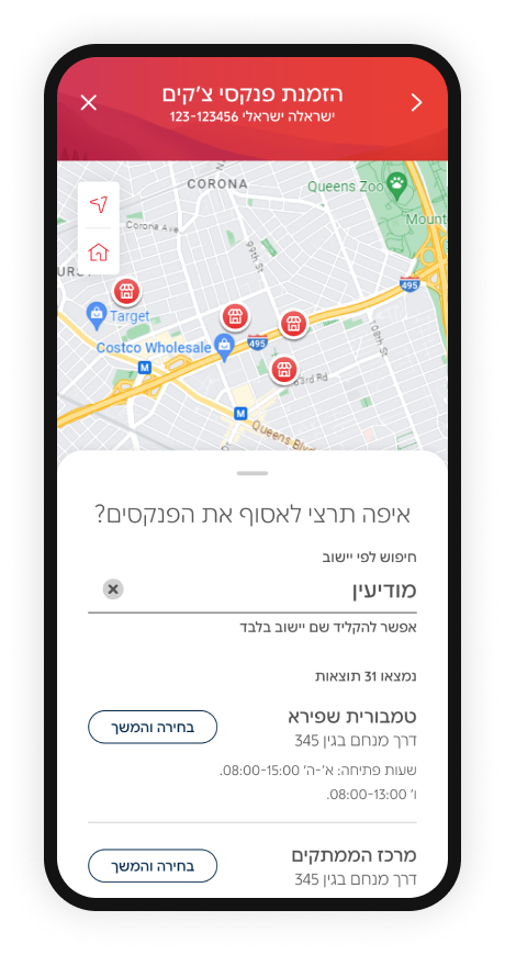
Designing a New Map Feature
This new feature was designed as a reusable asset for the app, supporting additional areas such as credit card pickup and ATM locations.
It includes a map that visually displays stores, along with a drawer for city-based search and a list view of available locations.


This includes the following components:


One to center on the user’s current location
To avoid early drop-offs, location permission is requested only when the user taps “My Location.”

One to center on the account address
One last testing before launching
Guerrilla testing showed that users couldn’t understand their position relative to the stores.
I added two orientation controls:
the Final map
The map feature combines visual store pins, a synchronized list, and city-based search into a cohesive system that guides users to the right pickup location. Orientation controls and a clear selected-pin state support decision-making, while deferred permission requests keep the flow smooth. It’s a focused, user-friendly solution built to overcome supplier limitations.
The map component itself is a future-ready asset for the bank, built to support additional products beyond checkbook ordering.
