Driving the Shift from Paper to Digital Mail
Enabling digital adoption by redesigning the mailbox for information at scale. All part of a low-resource initiative, without backend development.
Platform
App
My Role
Research, ideation, prototype, end-to-end design
TEam
PM, front-end developers, data team, UX Writer


📈
Increase digital adoption rate
Increase the percentage of customers opting out of paper mail and transitioning to digital delivery.
⏱️
Reduce banker handling time
Minimize the time bankers spend assisting customers with document-related requests.
💰
Reduce operational costs
Lower printing, mailing, and handling expenses associated with physical correspondence.
Business goals
The problem
The problem
The bank led a strategic initiative to reduce operational costs by shifting from physical mail to digital delivery and encouraged customers to opt out of paper correspondence. While the digital option was available, a significant portion of customers chose to continue receiving physical mail
The Challenge
How to Drive Digital Adoption Under Budget Constraints
We needed a budget-friendly plan to hit our goal on time. Without back-end developer we needed to decide what tweaks to make and how they'd lead us to the goal.


When a low-priority screen blocks adoption, how do you create impact without backend?
research
Everything we solved started with what users said
Before I joined the project, the analytics team ran a phone survey with customers who had chosen to continue receiving paper mail, in order to understand the role physical correspondence played in their daily financial management.
📖 67% read the letters sent to them
📂 50% store important documents; 33% keep a dedicated binder
📱 61% were unaware of the digital mailbox
📝 32% recalled giving consent to opt out of paper mail
Key survey findings
After joining the project, I treated the phone survey as a starting point. It highlighted a distinct group of users who actively read, store, and organize bank letters for long term use - behavior the digital mailbox would need to support if it were to replace paper. However, this did not reflect all users.
Two key dilemmas emerged:
-
How can we support “information managers” without adding complexity for others? The survey showed that a significant portion keep documents for years.
-
Should we focus on awareness or on strengthening management capabilities?
research
Data Analysis & Stakeholder Interviews
I pulled data and spoke with product and customer service managers and put it all together. This showed me where we needed to make changes to hit our goals.
📄
The reading experience was friction-heavy
due to constrained PDF display and poorly positioned controls.
🔍
The reading experience was friction-heavy
Document identification relies on trial-and-error opening rather than clear differentiation.
Key Takeaways from Data Analysis & Stakeholder Interviews
research
Competitor research
In addition to benchmarking other Israeli banks, I analyzed leading email and document platforms.
Analyzing direct competitors helped define current industry standards and identify opportunities for differentiation.
Reviewing non-banking platforms provided insight into how high scale information systems structure search, scanning, and document management - setting a higher usability baseline for user expectations.


Letter display:
Letter view:
Zoom in/out:
Filtering:
Actions:
Search:
Mark multiple letters as read:
Chronological list showing name & date
Full-screen
Pinch-to-zoom
By date
Delete/download single or multiple letters
Not relevant
Not relevant
Letter display:
Letter view:
Zoom in/out:
Filtering:
Actions:
Search:
Mark multiple letters as read:
Chronological list showing name & date
Full Page Slider
Pinch-to-zoom
By date & types of letters
Share single letter
Not relevant
Not relevant


Key findings from competitor analysis:
I analyzed how Bank Hapoalim compared to direct and indirect competitors in terms of quality and functionality: How much have other banks invested in their mailbox screens? What features have been developed?


Competitor analysis
Bank mailboxes solve viewing, not information management
-
Bank mailboxes function mainly as passive archives offering basic document viewing but very limited tools for ongoing management, organization, or decision-making
-
UX investment focuses on reading a single document rather than handling volume with minimal support for scanning, search, filtering, or bulk actions

Email platforms & PDF viewing tools
Documents are designed as part of an ongoing information flow
-
Flexible Reading & Scanning Experience
Smooth transitions between overview and deep reading are enabled through previews and full-screen document views
-
Built to handle volume
Search, filtering, and bulk actions are baseline expectations for managing content at scale
Bridging the Gap
Analysis
The combined research revealed that physical mail fulfilled an active information management role:
-
A significant portion of customers treat bank letters as long-term records, storing and organizing them for future use.
-
The digital mailbox limits efficient retrieval and document handling.
-
Banking mailboxes were built for single-document viewing, while users expect tools that support managing information at scale.
These findings led to a clear product shift: moving the mailbox from a document viewer to an information management system. This meant supporting information-heavy users without adding unnecessary complexity, while also addressing the awareness gap to drive adoption.
Full-text search in PDFs
Although this would help users unfamiliar with letter names, implementing it required complex backend development.
Instead, a simpler search by title was introduced.
Filtering by financial category
This would require significant internal system modifications, making it too difficult to implement.
Displaying additional dynamic information
Mapping and tagging hundreds of existing and future letters would be impractical.
Solutions Considered (and Rejected)
Finding the Right Solution Within Constraints
Ideation
To solve this, I collaborated closely with my teammates (PM, Frontend Developers,Systems Analyst) to explore multiple solution ideas to improve the mailbox experience, focusing on high-impact changes that could be delivered efficiently. The ideation centered on the main user pain point - difficulty in finding letters, which often resulted in customers reaching out to a banker.
Turning an outdated screen into a tool people actually want to use
solution
There are two key areas in the app that required redesign and optimization to make document discovery easier:
App Header:
In its current location within the “Contact Us” page, only 1% of users accessed the mailbox.
To increase visibility and usage, I proposed relocating the mailbox entry point to the global header, making it more accessible and consistently visible.
Mailbox:
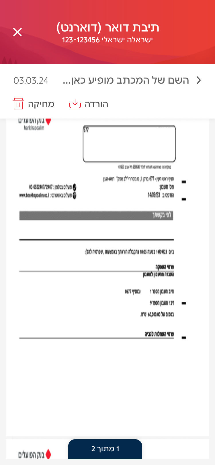
The mailbox required a redesign to address usability issues and the difficulty users experienced when searching for documents.
Additionally, the experience needed to clearly inform users if they had not opted out of receiving physical mail.
Creating flexible experience within a continuous information flow:
first release
No More Opening Letters One by One
A carousel-based PDF viewer allows users to visually recognize letters at a glance, enabling quick scanning and navigation without relying on exact document titles.


Solving action control placement issues:
Placed action buttons in a fixed upper section, appearing when at least one letter is selected. This allowed bulk actions on multiple letters simultaneously.
Solving readability issues:
-
Page indicator: added a navigation component to help users track their position in multi-page PDFs.
-
Pinch-to-zoom support: displayed letters in full-screen mode, with pinch-to-zoom functionality.
-
Download files: for seamless opening in dedicated PDF reader apps.
Increasing Digital Opt-In Among Paper-Mail Users
Second release
Turning Activation Moments into Digital Adoption
A contextual toast banner appeared within the mailbox while users engaged with their letters, leveraging that moment to encourage switching to digital delivery.
.jpg)

Clarifying Consent to Drive Adoption
Survey findings showed that some customers believed they had already opted out of paper mail.
To address this, paper-mail users were shown a dynamic post-login pop-up with three rotating value messages led by the UX writer to maximize resonance and drive digital opt-in.
Third release
Solving the search problem
A search bar with autocomplete for letter names, helping users who are familiar with the document title find what they need faster
.jpg)
%20(1).jpg)
Filtering by common letter names
Helps users navigate large volumes of messages when they don’t remember the exact document title, reducing friction and enabling faster access to relevant information.
